Trends & Insights
Your Marketing Dashboard Is Missing the Only Metric That Matters — Cost Per Subscriber by Channel
2026
.
3
.
12
By
Team Airbridge

If you run paid acquisition for a subscription app, you already know the ritual. Open Meta Ads Manager -- pull CPI. Open Google Ads -- pull CPI. Open RevenueCat -- check subscriber count. Open Google Sheets -- try to make the numbers talk to each other. Close everything an hour later, still unsure which channel actually produces paying subscribers.
The problem is not the data. The problem is that no single marketing dashboard shows the number you need first: cost per subscriber by channel. Without it, every dollar moved between Meta, Google, Apple Search Ads, and TikTok is a guess -- informed by instinct, not by subscription revenue data. CPS is the starting point -- paired with LTV, it tells you which channels produce subscribers who stay and renew, not just subscribers who sign up.
Key Takeaways
Subscription app growth teams have a reporting problem that no spreadsheet can solve. The data they need lives in three separate systems, each measuring different things in different ways.
A typical Monday morning for a subscription app growth marketer looks like this:
Three dashboards. Three partial views. None of them answers the question that determines your next budget decision: which channel produces the cheapest paying subscriber.
Marketing teams today operate with 12-20 different tools, each with its own tracking methodology. For subscription app teams running paid UA, the stack is familiar: Meta Ads Manager, Google Ads, Apple Search Ads, TikTok Ads, a billing platform like RevenueCat or Adapty -- and Google Sheets to tie it all together.
Customer interviews confirm the pattern. Growth teams at early-stage subscription apps report the same workflow:
The spreadsheet becomes the de facto marketing dashboard -- not because it works, but because nothing else connects the dots. The deeper problem: each data source uses different attribution logic, different time windows, and different counting methods. Combining them in a spreadsheet does not resolve those inconsistencies -- it hides them.
Manual reporting is not just slow. It is structurally unreliable.
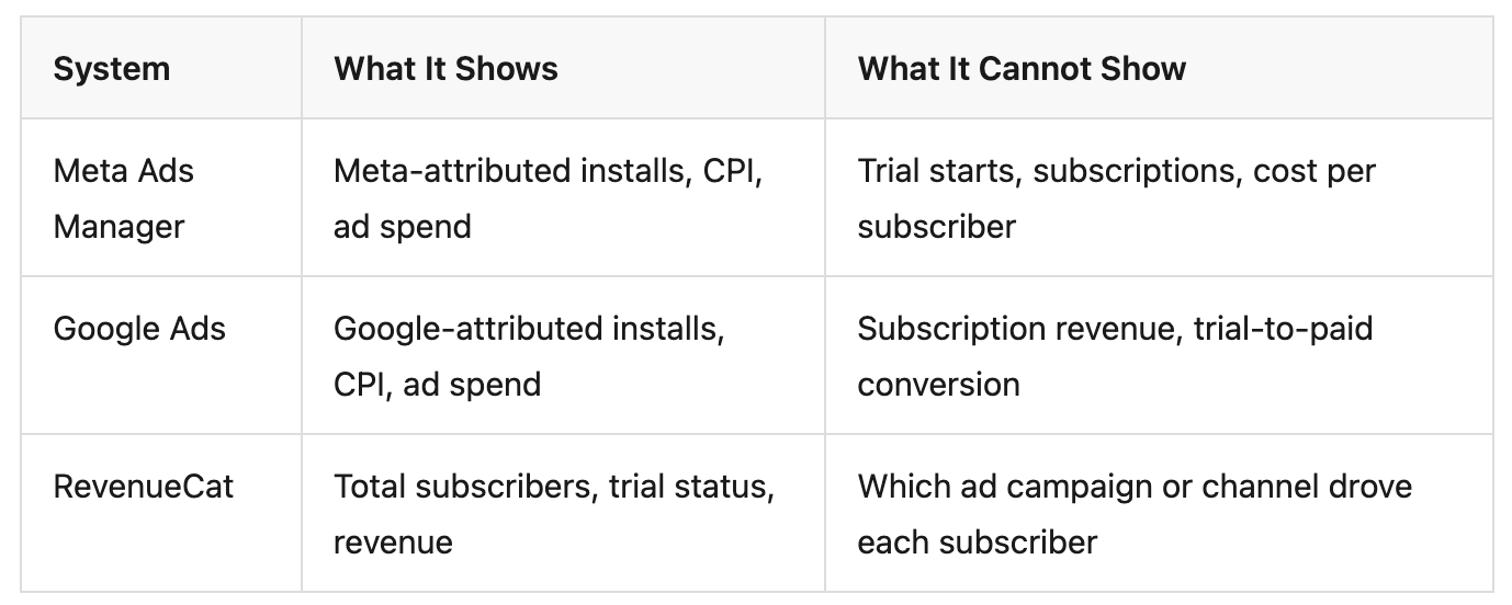
The problem is not that Meta or Google built bad dashboards. The problem is structural: ad platforms can only show what happens within their own walls, and subscription revenue does not happen there.
Self-Attributing Networks -- SANs -- like Meta, Google, and Apple Search Ads each use their own attribution models, lookback windows, and conversion counting logic.
When these numbers land in a spreadsheet side by side, they appear comparable -- but they are not. Each platform is answering a slightly different question about the same user. Attribution discrepancies between platforms can cause total reported installs to exceed actual installs by 20-40%.
When a user subscribes, the payment is processed by Apple or Google -- not by the ad platform that drove the install. RevenueCat, Adapty, or Superwall tracks who subscribed, renewed, or churned. Meta and Google know nothing about this.
This is why CPI exists natively in every ad dashboard but CPS does not. The install event fires immediately. The subscription event fires days or weeks later on a completely different server -- often while the app is not even running. A device-side SDK can only sync when the user reopens the app. Server-to-server (S2S) integration through an MMP is required to capture subscription events reliably, regardless of app state.
A typical subscription app offers a 7-14 day free trial. The install and trial start happen on day 0, but the paid subscription happens on day 7 or later. When the conversion lag exceeds the attribution window, the subscription event never links back to the ad that drove it.
For users on a standard 7-day trial, the revenue event occurs outside the default attribution window of most ad platforms. Every under-attributed subscription is counted as organic -- hiding the true value of paid channels and making CPS calculation by channel impossible. Aligning the attribution window with your trial length is the minimum requirement.
The fix is not a better spreadsheet. It is a marketing dashboard that connects ad spend to subscription revenue across all channels under one measurement standard.
The most basic requirement: see how each channel performs across the full subscription funnel. Not just installs -- the entire path.
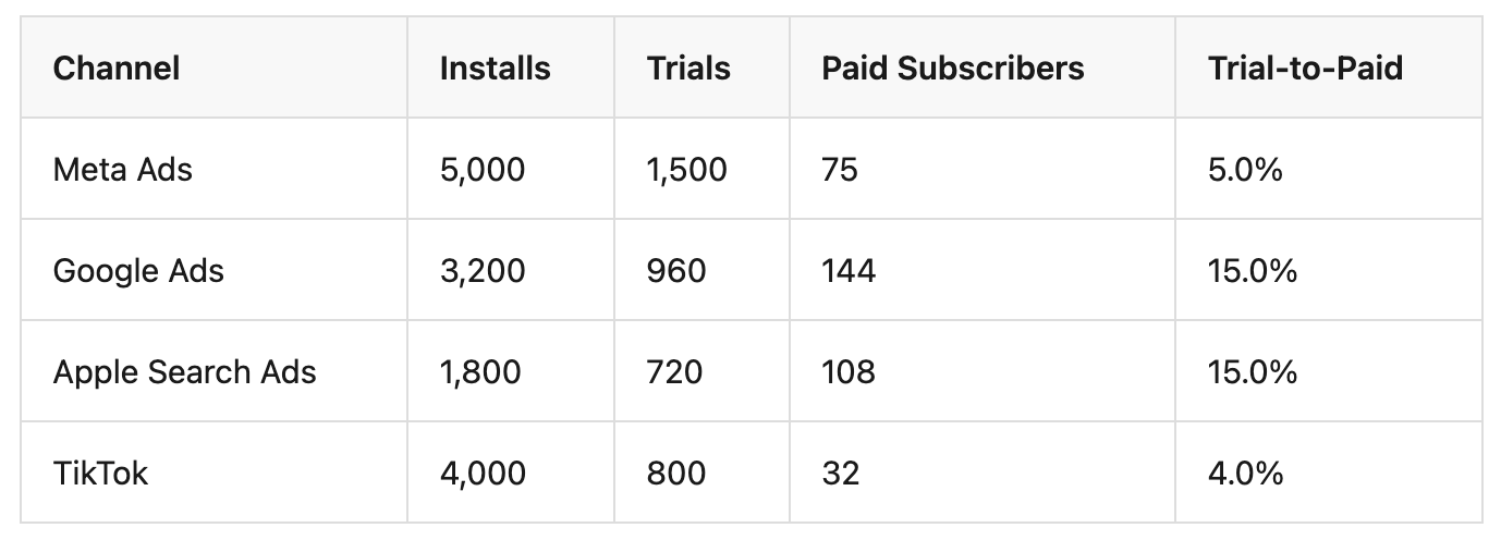
In this hypothetical example, Meta drives the most installs but has the lowest trial-to-paid rate. Google and ASA produce fewer installs but convert at 3x the rate. Without the full funnel view, the budget decision flips.
CPI -- Cost per Install -- is where most dashboards stop. But CPI alone is misleading for subscription apps.
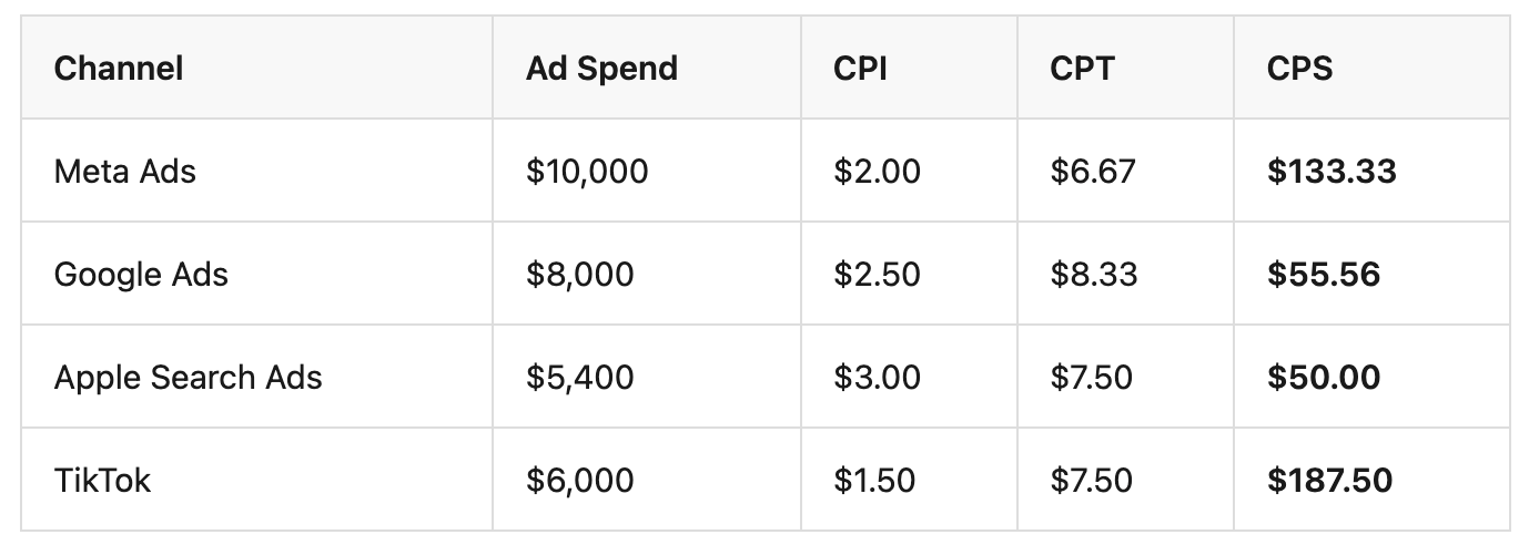
TikTok has the lowest CPI but the highest CPS. Apple Search Ads has the highest CPI but the lowest CPS. A marketing dashboard that only shows CPI would scale TikTok and cut ASA -- the exact opposite of what the subscription revenue data recommends. CPS reveals initial acquisition efficiency; pairing it with LTV shows which channels produce subscribers who renew beyond the first billing cycle.
Install attribution answers: "Which channel drove this download?" Revenue attribution answers: "Which channel drove this paying subscriber?" These are fundamentally different questions, and the second one is the only one that matters for budget decisions.
Revenue attribution requires connecting subscription billing data -- from RevenueCat, Adapty, or Superwall -- back to the attributed install. Without this connection, subscription revenue is visible in aggregate but invisible at the channel level. You can see that total subscribers grew by 200 this month, but you cannot tell whether Meta, Google, or ASA drove them -- so you cannot decide where to increase or cut spend.
A snapshot tells you where channels stand today. Trend data tells you where they are heading. Is Meta's CPS rising over the last 4 weeks? Is Google's trial-to-paid rate improving after a creative change?
Weekly Google Sheets exports cannot surface trends reliably. By the time the data is compiled, the trend may have already shifted. A proper marketing dashboard updates continuously and shows directional movement.
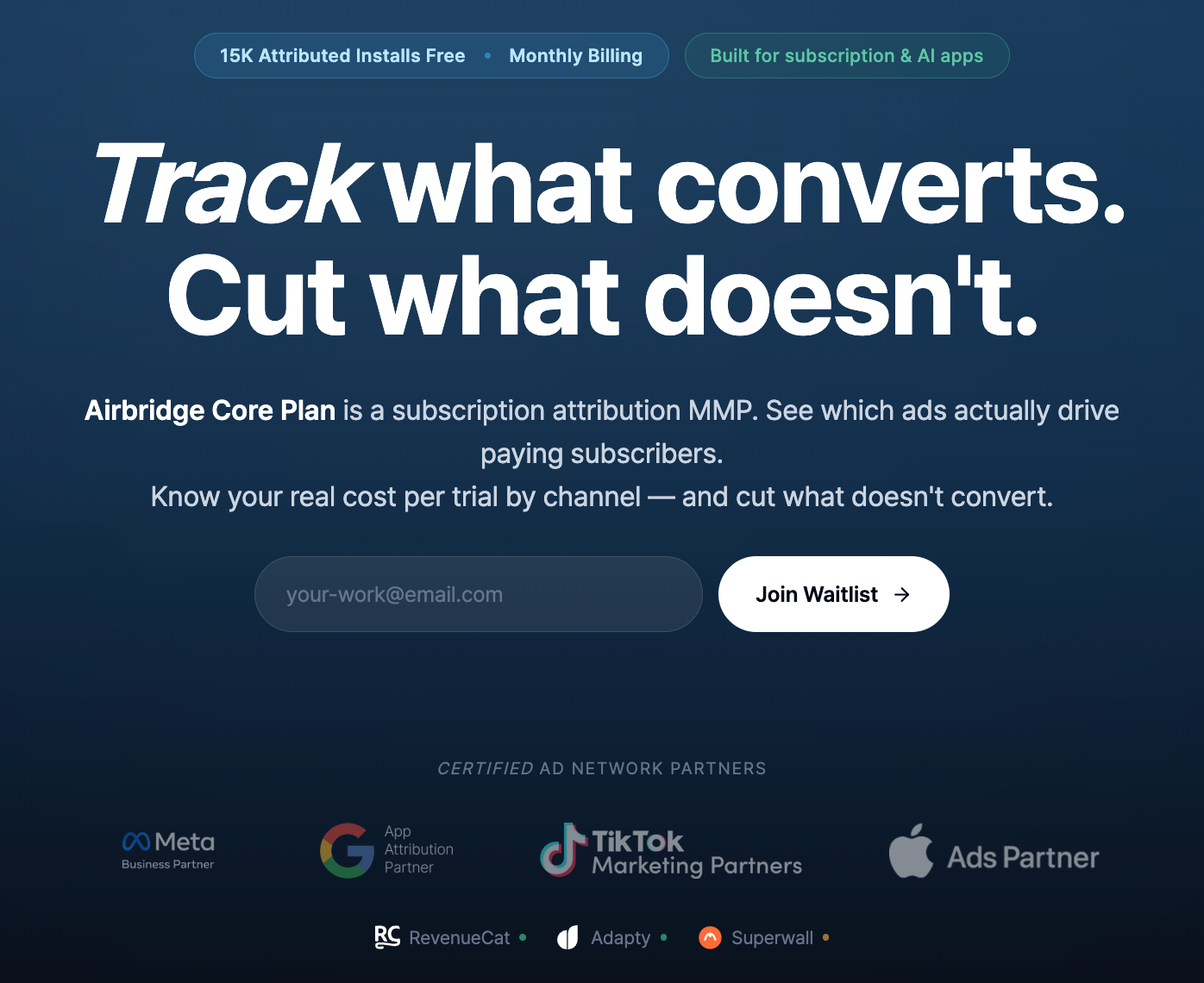
Airbridge Core Plan is an MMP built for subscription apps running paid UA on Google, Meta, Apple Search Ads, and TikTok. It connects ad spend to subscription revenue in one system -- replacing the spreadsheet workflow with built-in reports.
Airbridge Core Plan's Funnel Report shows the full conversion path -- Install → Start Trial → Subscribe -- broken down by channel and campaign. The Revenue Report attributes subscription revenue to specific channels and campaigns, making CPS visible at the channel level -- the metric that ad platform dashboards cannot show.
Together, growth teams can see CPI, CPT, and CPS by channel in one system. No manual stitching. No CSV exports. Standard events -- Start Trial, Subscribe, Unsubscribe, Order Complete, Order Cancel -- are pre-defined, ensuring consistent event definitions across all channels with no custom event schemas to design or maintain.
Airbridge Core Plan's native RevenueCat, Adapty, and Superwall integration eliminates the gap between subscription data and attribution data.
Subscription events flow from your billing platform into the attribution system automatically. Trial starts, subscriptions, cancellations, and renewals connect to the channel and campaign that drove the original install.
Meta, Google, and Apple Search Ads each use their own attribution model. When these numbers land in a spreadsheet, they look comparable but are measured differently.
Airbridge Core Plan applies one consistent attribution model across all four GMAT channels. Configurable Attribution Rules let teams set windows appropriate for subscription conversion cycles. The result: channel comparisons that are genuinely comparable because they were measured the same way. SAN-level biases and SKAN variance still exist, but a unified model ensures you are comparing apples to apples rather than mixing different counting methods.
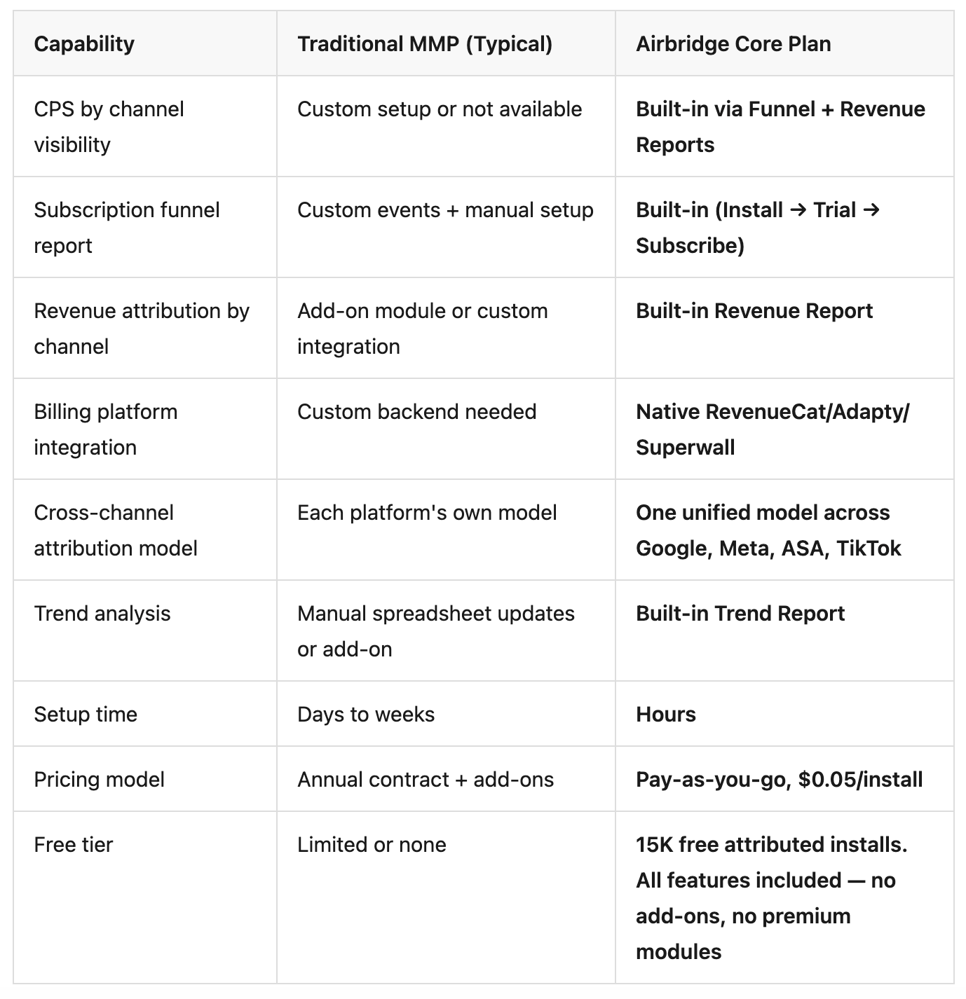
If you have already looked at traditional MMPs as a replacement for your spreadsheet workflow, here is how Airbridge Core Plan differs.
Every week your growth team spends comparing CPI in a spreadsheet is a week of budget decisions made without cost per subscriber by channel. The answer is not a better pivot table. It is a marketing dashboard that shows cost per subscriber by channel for subscription apps -- connecting ad spend to subscription revenue across every channel under one measurement standard.
See which channels actually drive paying subscribers -- not just cheap installs -- with Airbridge Core Plan. Start with 15K free attributed installs.