How to Design a Perfect Paywall for a Mobile App
When designing an app, many developers tend to focus on the feature design and the overall UI, sometimes neglecting the paywall – the page where the purchase should happen. 80% of purchases take place after the onboarding when the user sees the paywall for the first time, so it’s important to make a great first impression. Considering the paywall is the place where the user makes their final choice (to buy or not to buy), every aspect must be thought through, including the number of products, pricing, copy, design elements, and more. Our consistent overview will help you understand where to look and what to do when trying to design a perfect paywall for your app.
Prices and intro offers
Before getting down to the design part, it’s important to refresh on the way mobile apps are priced these days. Most of the apps use in-app subscriptions of various kinds, usually differentiated by the billing period. Here are the most popular ones:
- Monthly. It’s the gold standard of mobile subscriptions. With the price being about $5-10, users willingly pay for it if they see the value in the app. It’s pretty affordable and works great for paywalls with 2-3 offers, as well as being the only pricing option.
- 6-months. This one is usually found on the paywalls with 3 offers, rarely with 2. It serves as a middle ground between the monthly and the annual subscriptions. If you price it right, people might consider it rather beneficial and prefer it to the monthly one.
- Annual. If your app is about providing everyday benefits to the user or presenting them with fresh useful content on a regular basis, this type of subscription may work great for you. Once again, if people see the value in your app, they may be willing to pay more. So it’s up to you to price it so that it appears in the most favorable light.
- Lifetime. Basically, it’s a one-time purchase that allows the user to use the app for an unlimited period of time. It might be right to use this option at the beginning of your app’s growing process to get some money for future investments, but you should understand that every lifetime user is a missed paying recurrent one.
Some other types of subscription can also be found in apps, such as weekly, 2 or 3 months, etc. They don’t always work for everybody, but they may be useful to experiment with (we’ll talk about this later). As for the pricing itself, the best way is to check the competitors and start with the prices equal or even lower than theirs, but never higher, it’s too risky.
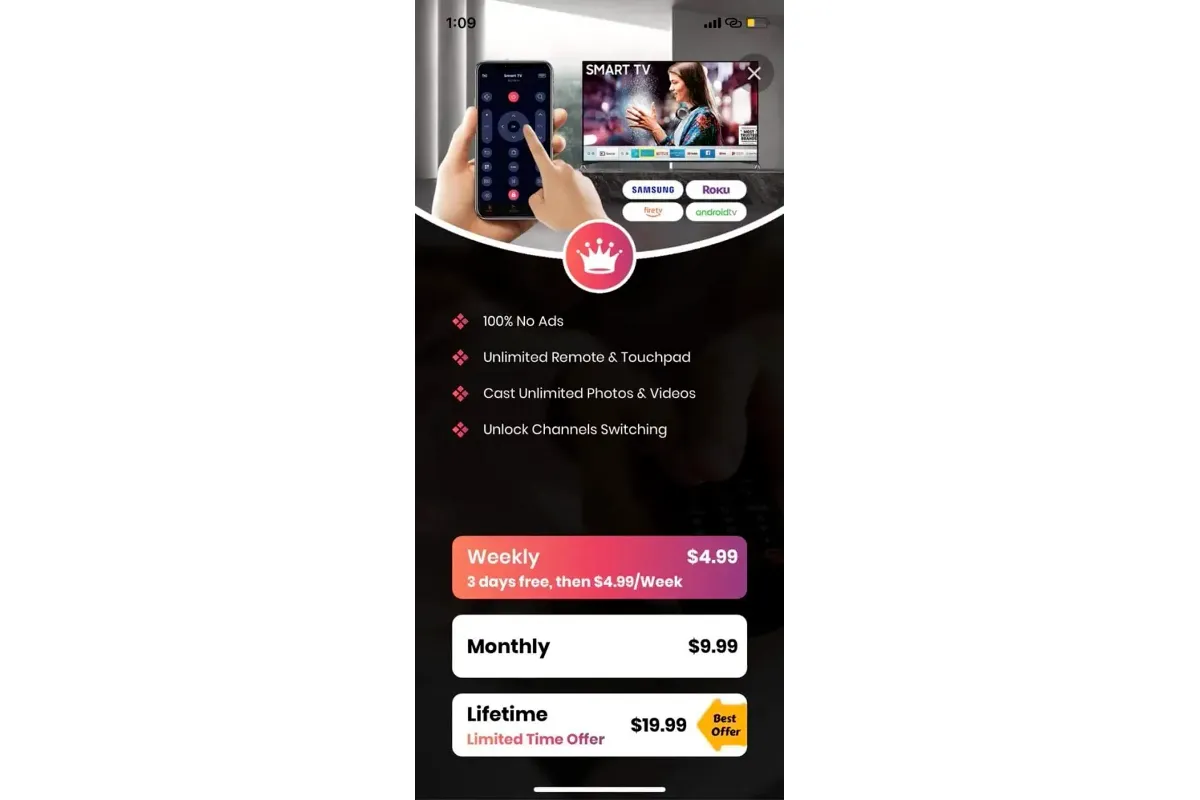
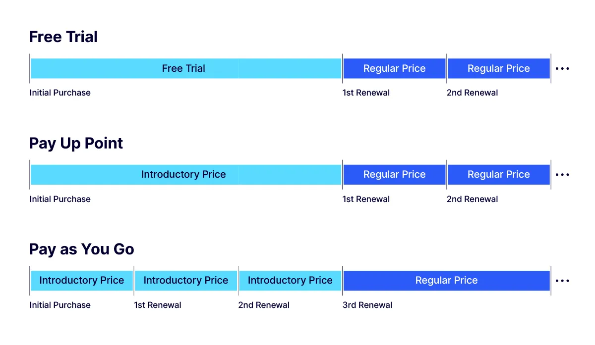
What also should be taken into consideration is the intro offers you may want to use. There are 3 of them: free trial, pay as you go, and pay upfront. The first one offers to use the app for free for a limited period of time before purchasing it, while the other two provide introductory prices that make purchasing look more beneficial. With pay as you go, you get to pay for the subscription with a discount usually for a couple of months, when pay upfront offers a one-time discount. These offers are a great addition to the wisely chosen subscription types and the product structure of the paywall in general, which we’re going to talk about right now.
Number of products
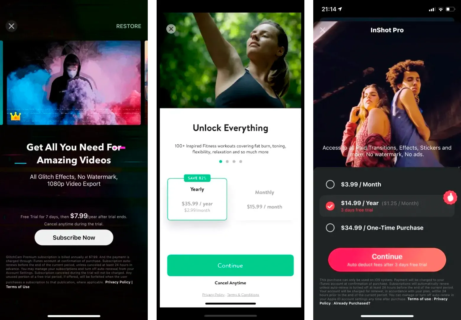
Now that we’re done with the prices and offers, it’s time to decide what structure your paywall should follow, meaning how many products you want to offer. You can try coming at it from a creative angle and choose the one you visually like best, but we’d recommend taking into consideration the pros and cons of each variant. Mobile app paywalls usually offer 1-3 products, depending on various aspects. Here’s what you should know:
- 1 product. Paywalls with one product are usually pretty straightforward. They clearly state the advantages of the app and prevent the user from the dilemma of which offer to choose. On the other hand, they don’t provide you with much room for price experiments and can’t let you properly understand the paying capacity of your potential subscribers.
- 2 products. This type of paywall gives you more freedom both in terms of what types of products to use and what prices to place on them. Bear in mind there should be a decent price contrast between the two offers, otherwise the paywall may look confusing.
- 3 products. Here you get much more room for experiments and get to better understand the preferences of your target audience. Having three different offers on the paywall is a good way to attract the users of any paying segment. But what’s more important, knowing your target audience may help shift them to the product you actually want them to buy more, by making it look more appealing than the other two.
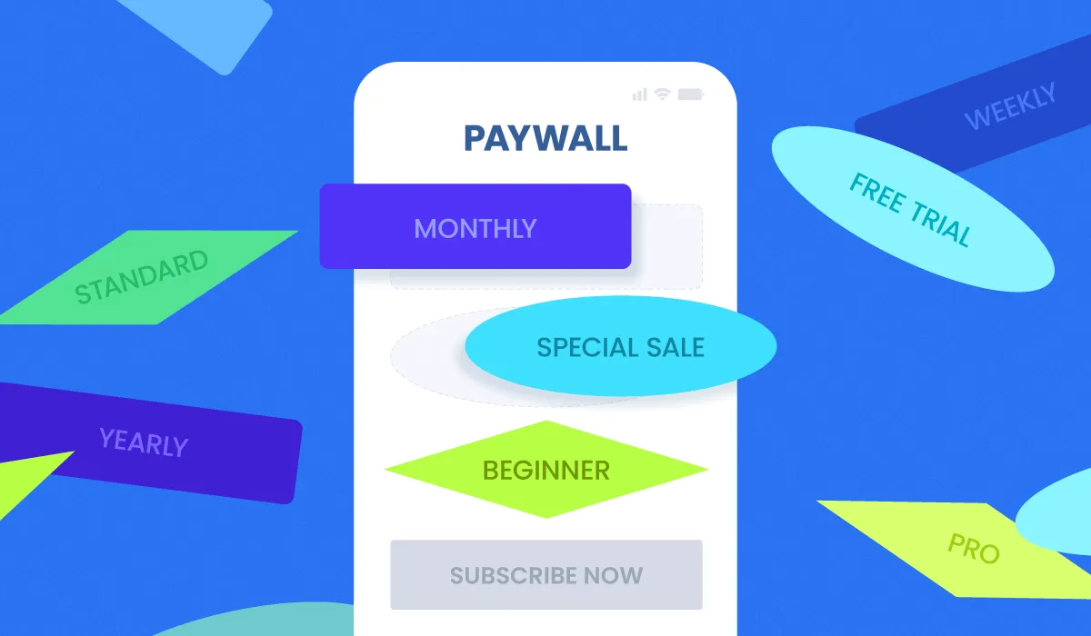
Design elements
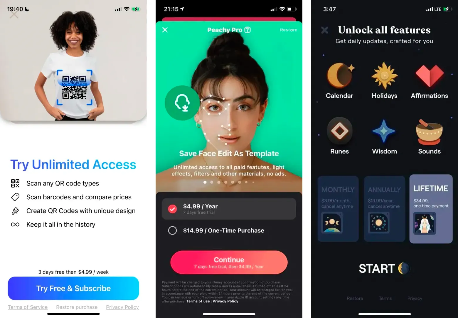
When you’re through with the initial pricing options and the product number, it’s time to get creative (but don’t get carried away, there are still guidelines to follow). The visual representation of a paywall may differ drastically from app to app. It’s possible to identify at least 10 most used types of mobile paywalls, but in reality – your paywall is a construction set that you can adjust to your liking. So it’s simply worth knowing what elements a good paywall should consist of and then create the one that would suit your app the best. Let’s go from top to bottom and see what elements are essential.
First of all, to hook the user’s attention, your paywall should include imagery that must neatly correlate to the essence of your app. It’s always good to place a stock photo or a specially designed illustration at the top. Some apps even use videos, which can provide even more visual information about the value of your app.
Next comes the copy. This is where you must be both creative and straightforward. You can add some artistic touch to the headline but it’s better to be clear and honest when listing the benefits of your app. Your potential users should be able to see the value in purchasing your app, plus, your paywall should contain no misleading information if you want to pass the app store review.
After the benefits are mentioned, it’s time to place the pricing options. Usually they are designed as badges with the subscription options info placed inside of them. The most popular way is to make them in the toggle form, so that the user can tap and select the preferred option and then hit the purchase button below. However, sometimes the badges itself bear the purchase button function, which makes the purchase one step quicker.
The purchase button is also important, as it basically calls the user to make a certain action. So make sure to find the right word for it without being misleading. For example, writing “Purchase”, “Buy” or “Subscribe” is straightforward and fair, while writing something like “Start your free trial” for a subscription with a free trial may be wrong, as after the trial is over the user will be billed.
Make sure to also add all the necessary links down below. Most of the time they are terms of use, privacy policy, and the restore purchase button.
Want to see how Paywall works with your data?
Get hands-on with Airbridge and see real results.
Try It Free →Analytics and A/B testing experiments
Now that you’re done with the creative part, you need to make sure your paywall works the way you intended. To do this, you need to be able to track all the user events (such as page views, button taps, scrolls, purchases, etc.) and view the conversion rates to analyze the performance of your paywall. A convenient way would be to use an analytics system that works great with mobile apps, like Adapty. It provides precise and accurate analytics and turns all the user actions into user-friendly reports. But this data is not something you can just view and draw conclusions from, it can be directly used to improve your paywall with the help of experiments.
If you look at the analytics of your paywall and see low conversion rates, it’s not a case for disappointment, because you’ve already managed to get this information and now you can use it to improve your paywall. You may build a few hypotheses on what goes wrong, like maybe the price is too high, or the text doesn’t expose the real value of the app. But making blind changes will be too time consuming (making changes in the app, releasing a new version, waiting for another app review) and even dangerous, as you may accidentally drop your conversion rates even lower if the hypothesis was wrong.
The best way to check your hypothesis is to run an A/B test, and Adapty will cover you in this case as well. Running paywall experiments is not that difficult: you create two paywalls, usually with one variation (e.g. different monthly subscription price), split the traffic (usually 50/50, but not necessarily) and after a certain period of time (2-4 weeks) get the results and check if your hypothesis was correct or not. The advantage of this approach is that you don’t risk much even if the hypothesis is not correct, as you split the traffic. But what’s more important – you don’t have to release new versions of the app, as Adapty SDK enables you to make changes on your paywall with the help of remote config, which saves tons of time. Running A/B tests with your paywalls is a sure way to increase your app revenue up to 30% in the first couple of months.
User acquisition and attribution
Split-testing is a great way of finding the most profitable pricing and increasing your conversion rates, but there may be one problem. If your app doesn’t have enough users/downloads/installs, it might be problematic to run A/B tests, as you’d simply not have enough data to get statistically significant results. So it’s also vital to make sure your app is promoted as much as possible. Although there are many different ways to promote an app, counting on the organic traffic only would be rather naive. To get higher UA numbers you may have to invest in advertising, which is usually carried out via store ad managers, ad networks, social networks, or in-app ads. You might want to try all of these variants to find out which works best for you, and Airbridge can help you with that. An MMP like this will help you not get confused and properly measure campaign performance across different marketing channels. This way you’ll know which channel to focus on and invest more into. And if your app has a web version, Airbridge supports cross-platform attribution with the ability to view the data of both platforms in one dashboard.
Once you’ve started running A/B experiments and purchasing traffic, you’re sure to stumble upon an idea of making more than one paywall, and it’s always a good thing to try. Different channels may bring different kinds of potential users, so it may be useful to create a paywall for each channel, with unique offers or unique design. And in this case, Adapty is sure to cover your A/B testing needs, when Airbridge will support your attribution analytics. It takes time to find the most profitable source and the most loyal paying customers, but if you regularly experiment and test new hypotheses, your app will grow much faster than if you just made blind decisions.
Conclusion
We’ve covered all the essential aspects of making a great mobile paywall. To sum up, here are the key points that will make your paywall more appealing to the user and help you pass the store review:
- Choose the right prices and intro offers. Bear in mind what your target audience is and make sure that your offer coincides with their paying capabilities.
- Think of the structure. Choose the number of products on your paywall depending on the value of your app. The more it has to offer, the more subscription types you can try.
- Hook the user with imagery. People perceive visual information much faster and tend to make their choices based on that, so make sure to strike them with the appropriate graphic design.
- Make everything clear. The user should easily understand the value of your app, the price they’re going to pay, the period of time they’re subscribing to, the length of the trial period, etc.
- Use analytics and run experiments. Check the metrics and conversion rates of your paywall to see its strong and weak points. Come up with hypotheses, check them by running paywall A/B tests, and grow your app’s revenue.
- Make sure to attract enough traffic. Getting organic traffic may not be that easy in the competitive mobile app world. So don’t be ashamed to purchase ad traffic and make sure to take care of your attribution analytics.


Ready to transform your mobile growth?
Learn how Airbridge helps leading brands measure and optimize every touchpoint.