App Store Listing Conversion: Screenshots, Icon Tests and Ratings
On this page
Keywords get your app into search results. Your listing decides whether anyone installs it. A better page gets more from the traffic you already have, including the installs you pay for.
This guide covers the first three screenshots, how to test an icon, and when to ask for ratings. This method comes from App Masters, the App Store Optimization (ASO) agency and YouTube channel founded by Steve P. Young, checked against Apple's documentation. App Masters sells ASO services, some of its videos are sponsored, and its results are its own reported wins. So we separate what Apple documents, what App Masters reports and what we think. Treat every reported result here as one team's anecdote. This guide covers iOS. Google Play evidence in these sources is thin.
What is known about conversion and rank
Apple lists downloads, ratings and reviews among the user behaviors that affect search results, and it says ratings and reviews influence rank, without giving a size for either effect. A better listing may help rank through more downloads, but we found no App Masters case that shows it, so judge listing work by what it does on the page.
The first three screenshots
Apple's facts. You can show up to 10 screenshots. Depending on orientation, the first one to three appear in search results when you have no app preview, and Apple tells you to make them show the essence of your app. Guideline 2.3.3 says screenshots should show the app in use, not just title art, a login page or a splash screen.
App Masters' view. These first images carry most of the weight, since fewer people swipe further. Slots four to ten still help, but they deserve less of your time.
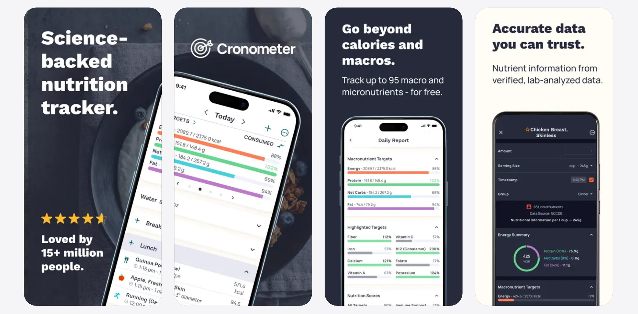
Cronometer's first screen echoes "nutrition" and "tracker" from its subtitle, then shows the product. US App Store, November 2026.
A simple working order for portrait screenshots:
| Slot | Job |
|---|---|
| 1 | Match the search and say what the app does |
| 2 | Show your clearest difference |
| 3 | Show a second difference, or proof |
| 4 onward | One benefit or feature per screen, as Apple advises |
Check all three at the size people see them. Reduce them to search-result size on a phone and try to read the captions.
Slot 1: match the search
Line up the first screenshot with your app name and main keyword, using large text. The person searched for something, and the first image should confirm they found it. This matters more the more you rely on organic search.
Video: How to Create App Store Screenshots That Get More Downloads, App Masters.
Apple's text relevance list doesn't include screenshots, so choose your caption for the person reading it.
One test for the first slot: if someone saw only this image, could they say what the app is for? A logo, a splash screen or a vague slogan fails that test.
Slots 2 and 3: your difference and your proof
One public example is a cognitive behavioral therapy (CBT) app. The losing version used general wording about calming anxiety. The winning version put "CBT" in the first caption, used Editor's Choice as social proof, and highlighted a conversational video therapy feature, with CBT journaling on the third screen. App Masters reports a 30% lift in downloads from this A/B test. Steve calls it an older case, and the video states neither sample size nor duration.
Read that result with care. The winner changed the wording, the selling points and the order at the same time, so nobody can say which change did the work. The losing version also had social proof, so the video can't show that proof made the difference. The app was also already first for "CBT" search. App Masters presents this as a win without changing keywords. That is true for metadata, but the caption did gain a keyword.
The more useful part is how they found the selling points. One came from using the app first-hand. The other came from asking the team which feature users loved. You can do both this week. Read your reviews and support tickets too, and note the phrases people repeat.
For proof, use real signals such as Editor's Choice or an award badge. Steve says faces in the first three screens help, but his own tests of people against interface shots had only just started, so test this before you rely on it. Keep any proof specific. Guideline 2.3 expects metadata to reflect the app accurately, and an invented badge is a risk as well as a weak signal.
Captions: outcomes, not features
Steve's demonstration is small and clear. He rewrites a caption about sharing and exporting into one about sending files faster. That is his judgment, and it's untested.
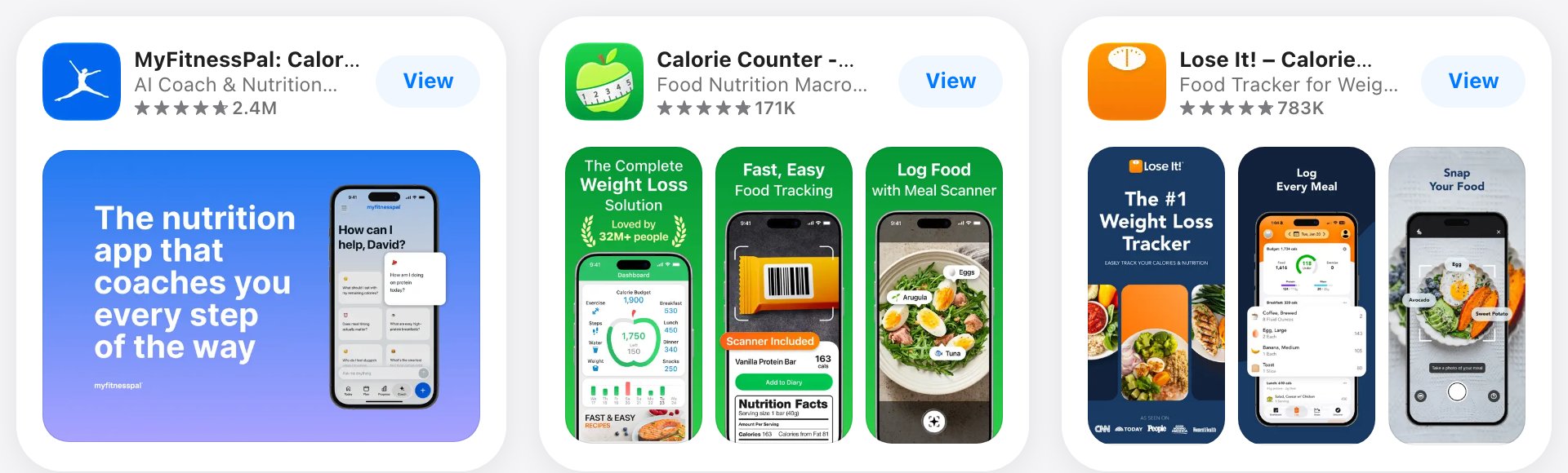
Search-size captions. "Log Food with Meal Scanner" names a feature. Ask what the user gets from it. US App Store, November 2026.
Try this on each caption. Read the feature name, then ask what the user gets from it.
| Feature caption | Outcome caption (our examples) |
|---|---|
| Sleep tracking | See why you woke up tired |
| Budget categories | Know what you can spend today |
| Workout library | Finish a workout in 20 minutes |
Keep it short, and only promise what the app does. For health or money apps, be careful with claims, because guidelines limit what you can say.
What to test next
Good test topics include brand design, seasonal art, orientation, captions, video and screenshot order. Two examples are humbling. In an Angry Birds test App Masters cites as featured by Apple, the standard screenshots beat the seasonal ones, and Steve's own reorder test on his app Paraphrase AI won by only a small margin.
On video, Steve says previews tend to help games and are usually unnecessary for other apps, and that he has seen them hurt. Note that a preview changes what appears in search, since Apple says screenshots fill those results when no preview is available. Previews autoplay on mute, so the opening seconds have to work without sound.
Expect many tests to end small or flat. Public case studies show winners.
Want to see how App store listing conversion works with your data?
Get hands-on with Airbridge and see real results.
Try It Free →How to run an icon test with Product Page Optimization
Product Page Optimization (PPO) is Apple's built-in A/B test for your product page. It can test icons, screenshots and app previews.
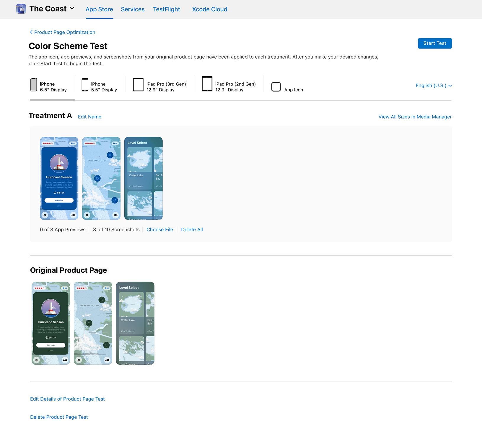
A product page test in App Store Connect. Image: Apple.
Apple's rules:
- You can test up to three treatments against your original.
- You can run one test at a time, for up to 90 days.
- You choose a traffic proportion. In Apple's example, a 30% proportion across three treatments shows each treatment to 10% of traffic.
- Alternate icons must be in the binary (the app build) of the published app version. Tests without icons can go to review without a new version.
- New metadata in a treatment needs App Review approval before the test goes live.
- Apple recommends waiting for at least 90% confidence before acting on a result.
- Tests aren't available for custom product pages.
- Treatments reach people on iOS 15 and iPadOS 15 or later.
The procedure. This order follows an App Masters walkthrough with an indie developer, checked against Apple's help pages where they cover the step.
- Choose one clear difference, something visible like color. Keep screenshots the same.
- Add your current icon and each test icon to the Xcode asset catalog. Apple asks for 1024 by 1024 pixels.
- In the walkthrough, the developer turns on "Include all app icon assets" in the app target's General settings. Apple's PPO pages don't name this setting, so check it against your Xcode version.
- Archive the build and pass normal review. The icons have to be in the version on the App Store.
- Create the test in App Store Connect. The App Icon tab appears only if the live build holds more than one icon. If you can't see it, go back to steps 2 and 3.
- Pick your treatment count, traffic proportion and localizations, then send the treatment to review.
- Avoid releasing a version that changes the tested assets, because Apple warns this may affect results.
The walkthrough also warns that an unfinished draft blocks new uploads, so plan your order of work before you start.
Check your traffic first. This is where many small apps should stop and think. Apple's setup screen estimates how long a test may take. Each extra treatment makes it longer, and Apple warns you may not reach your goal within 90 days. If the estimate is out of reach, use one treatment and a large visual difference, or spend your time on something else.
In the walkthrough, the test was on a pre-order app and the result had zero confidence. The people in the video still picked a direction from it. We don't treat that as evidence that any icon wins. Zero confidence is noise, whatever the percentage on screen says. Icon advice from Apple's design guidelines is safer ground: one clear idea, no needless detail, and legible at small sizes.
When to ask for ratings
This is the part of the App Masters advice that has changed most, so check the date on any video you follow.
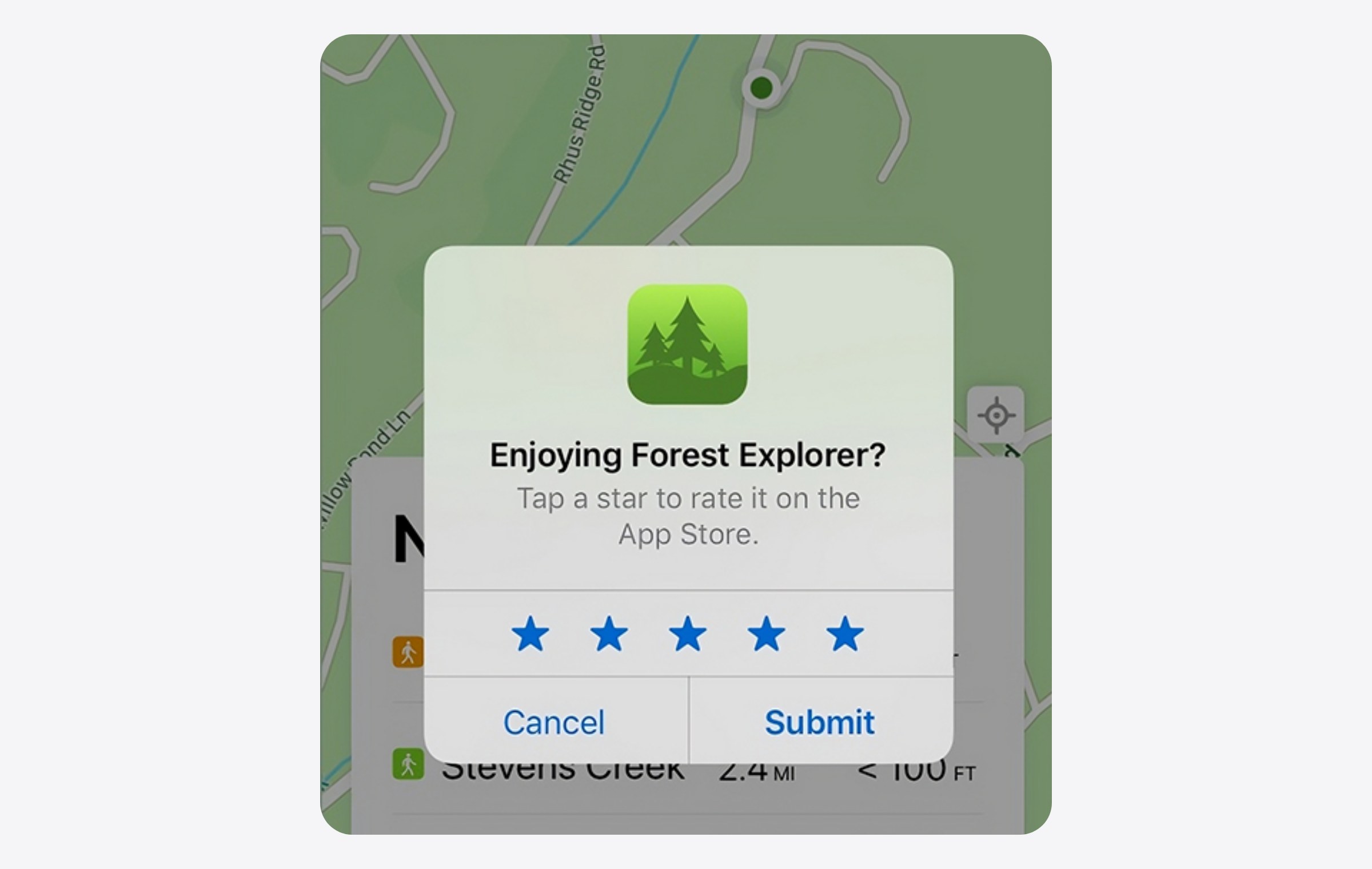
The system rating prompt. Image: Apple.
| Video date | What App Masters advised |
|---|---|
| Jan to Jun 2025 | Ask early, in the first experience |
| Aug to Sep 2025 | Ask after the paywall or trial start, or before the paywall in onboarding |
| Oct to Nov 2025 | Says some apps were getting warnings from Apple, and drops rating prompts from its checklist |
| Feb 2026 | Stop asking after onboarding or the paywall. Ask after a win moment (a moment when the user has just got value), or on the second or third session |
Follow the latest version. Avoid first launch, onboarding and the moment right after the paywall.
The old advice rested mainly on one case. A four-year-old utility app moved its prompt to just after trial start. App Masters reports monthly ratings going from about 50 or 70 to about 400, with the average rising from 4.3 to 4.5. That is a before and after comparison with no control group, and Steve calls it an old case. Our read is that the prompt also changed who was answering, since it reached only people who had just started a trial. So the higher average may reflect a different sample, not a better app.
Apple's rules:
- The system prompt can appear up to three times in a 365-day period, and people can turn these prompts off.
- Use Apple's API. Guideline 5.6.1 disallows custom review prompts.
- Guideline 3.2.2 says you can't force a rating or review to unlock features or content.
- Apple warns against filtered or incentivized feedback. Asking only happy users is not a safe workaround.
- Apple's design guidance says to wait until people have shown engagement, and to avoid first launch, onboarding and interruptions. It suggests leaving a week or two between requests.
- Apple's StoreKit guide adds two details. Don't show the prompt right at launch, even on a later launch. Don't trigger it from a button tap. For a "Rate us" button, link to your App Store page instead.
Apple's guide does not contradict the second or third session idea, but it changes how you apply it. Don't fire the prompt when session two opens. Wait for a natural stop within that session.
Pick a win moment for your app. Finishing a game level or logging a first habit are two examples. For a subscription app, think of the first time the product delivers its promise: a completed workout, a finished lesson, a first useful report. Show the prompt on the screen after that moment, once the task is done.
With only three prompts a year, spend them well. Apple's example waits for four completions and calls that number arbitrary. If most users only get there once, ask after the first.
Keep your goal in proportion. Steve calls chasing rating counts vanity, and suggests aiming for 100 ratings, then 1,000. His rule of thumb is that about 1% of downloads leave a rating. He also believes ratings help paid campaigns, while saying this is his opinion.
Downloads are not subscribers
A listing test tells you which page got more installs. It doesn't tell you which page brought people who pay. PPO measures page conversion, and the screenshot videos stop at the download.
A sharper promise can bring more installs and fewer subscribers. So the question to carry past every win is simple: did trial starts and paid conversions rise too?
This is easier to answer for traffic you pay for. Airbridge Core Plan attributes trial starts and subscriptions to campaigns across Google, Meta, Apple and TikTok. The Revenue report and Funnel report show which campaigns lead to paying users. With Apple Ads Advanced and the Campaign Management API integration, you can break that down by keyword. Compare trial and paid rates for the same campaign before and after the listing change. Core Plan starts with a 30-day free trial, then $40+/mo. Rank and download counts won't give you that view.
To see these ideas on real apps, browse our ASO teardowns. If you're still working on how people find you, start with our keyword research guide.
This guide is based on App Masters' YouTube channel, checked against Apple's documentation: Creating your product page, Product Page Optimization and Ratings and reviews.

Ready to transform your mobile growth?
Learn how Airbridge helps leading brands measure and optimize every touchpoint.
“Braze is a powerful tool on its own, but when paired with Airbridge, it creates synergies for retargeting campaigns, saving resources and enhancing performance.”