Updated ASO teardown, US App Store
LMCT App Store optimization
A Business app's App Store page, taken apart: the screenshots and why each one helps people decide to download, the icon and design system, and an ASO score out of 100.
- Est. monthly downloads
- 6K−13.6% vs previous month
- Est. monthly revenue
- $41K+0.8% vs previous month
- Est. revenue ÷ downloads
- $6.83
- Rating
- 0.0★0 ratings
Downloads and revenue are third-party est. for the US App Store, latest month vs the month before. Revenue includes renewals, so revenue ÷ downloads is a rough ratio, not what a new user pays. Estimates as of ; rating and dates from the App Store, .
Screenshots and why they convert
4 screenshots of up to 10. The first 3 show in search results when there's no preview video.

#1In search results
- What it shows
- The LMCT logo on a white splash screen inside a phone frame, with the logo repeated above the phone on a light blue background.
- Why it converts
- A splash screen only shows a logo. It does not say what the app does. App Review Guidelines 2.3.3 say screenshots should show the app in use, not only a splash screen.

#2In search results
- What it shows
- A login form with User Id and Password fields, a Login button and a Settings link.
- Why it converts
- A login page tells a visitor nothing about the benefit of the app. Apple's guidelines name login pages as something screenshots should not only show (2.3.3).

#3In search results
- What it shows
- A home screen in French with a welcome line for a distributor account and four activities: ship a lot, receive a lot, open requests, destroy a product.
- Why it converts
- This is the first image that shows real tasks, so a visitor can start to guess what the app is for. It is in French, and nothing printed explains who the app is for.

#4
- What it shows
- The same home screen in English: Dispatch Consignment, Receive Consignment, Open Requests, Destroy Product.
- Why it converts
- It shows the task list in English, which suits a visitor reading the English page. It repeats the previous screen, so it adds no new feature.
Icon and design system
What makes the page read as one brand at a glance.
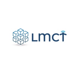
- The icon is the full logo: cubes plus the wordmark. The name is readable at large size.
- Text is not essential here, since the app name is already shown beside the icon. Apple's icon guidance says to include text only when it is essential.
- The cubes and thin signal lines are fine detail. They may be hard to read at the smallest sizes.
- A white background with a small logo leaves a lot of empty space, so the mark may look small in a row of icons.
- 01
Logo as the header
Most images have the same logo above a phone on a light blue background. The look is consistent, but the logo takes the place of a caption.
- 02
No printed captions
No image has a benefit line. A visitor must read the app screens to learn what the app does.
- 03
Splash and login first
The first two images show a splash screen and a login form. These are the screens Apple says should not be the only content (2.3.3).
- 04
Real UI with small text
The phone shows the actual app. Its text is small, so labels may be hard to read in search results.
- 05
A second language version
One image shows the home screen in French and another in English. The set does not say why, so a visitor may be unsure which one applies.
ASO score breakdown
6 of 100 points. The full rule is under “How the ASO score works” below.
- App name1 / 25
- Uses 4 of 30 characters1.3/10
- Brand + keyword phrase0/10
- Keywords fill half the name or more0/5
- Screenshots5 / 35
- Caption on every screenshot0/5
- Each caption names a feature people search for0/10
- First screenshot shows the main use0/5
- One consistent design system5/5
- Readable at search-result size0/5
- Trust signal0/5
- Ratings0 / 25
- 0.0 average (full marks at 4.8)0/15
- 0 ratings (full marks at 100,000)0/10
- Freshness0 / 15
- Last update 945 days ago (full marks within 30)0/15
Where the points are
- Ask happy users for a rating+25 pts
0.0 stars from 0 ratings. Apple's in-app rating prompt can be shown up to 3 times a year; show it right after a user finishes something in the app.
- Use the rest of the app name+24 pts
26 characters are free. Add the next most important search term.
- Ship an update+15 pts
The last update was 945 days ago. A new version also refreshes the "What's New" notes people read before they download.
- Win back installs
Downloads fell 13.6% while revenue rose 0.8%. A product page that converts more of its visitors wins installs back without more ad spend.
Apply it to your app
A checklist for your next product page update.
- Show the app in use in the first image. Do not open with a splash screen or login.
- Add a short caption that says what the app does and for whom.
- Put your strongest task screen first, and move sign-in screens out of the gallery.
- Use a different feature in each image instead of repeating a screen.
- Make the text in the phone large enough to read at search-result size.
- Keep the screenshot language the same as the language of the page you target.
How the ASO score works
- 01
App name, 25 points
Up to 10 for how much of Apple's 30 characters it uses, 10 for a brand + keyword structure, 5 when keywords fill half the name or more.
- 02
Screenshots, 35 points
Captions on every image, captions that name searched features, a first screenshot that shows the main use, one design system, readability at search size, and a trust signal.
- 03
Ratings, 25 points
Up to 15 for the average (from 4.0, full marks at 4.8) and 10 for the count (from 1,000, full marks at 100,000 ratings).
- 04
Freshness, 15 points
Full marks for an update in the last 30 days, falling to zero at 180 days. 85+ is excellent, 70+ strong, 50+ fair.
Common questions
What is an ASO score?
A 100-point check of the parts of an App Store page you control: the app name, screenshots, ratings and how recently the app was updated. It's our own scoring rule, shown in full on this page, not a number from Apple. Use it to compare your page with apps that already sell well in your category.
How long can an app name be on the App Store?
30 characters. Apple also gives you a 30-character subtitle and a 100-character keyword field for more terms.
Which screenshots show up in App Store search results?
The first one to three, when the app has no preview video. That's why the first three should cover the main reasons people download.
How many screenshots can an iPhone app have?
Up to 10 per device size. Apple recommends focusing each screenshot after the first on one main benefit or feature. LMCT uses 4.
Where do the download and revenue numbers come from?
They're third-party estimates for the US App Store, not figures reported by the developer. Treat them as a sense of scale. Growth compares the latest month with the month before.
Do screenshot captions help an app rank in search?
Apple says search results use text matches in the app name, subtitle, keywords and primary category, plus user behavior such as downloads, ratings and reviews. Captions aren't on that list: they help people who already see the app decide to download. When a caption names something people search for, put that term in the keyword field too.
Where the numbers come from
- Apple: Creating your product page
- App name limit (30 characters), up to 10 screenshots, the first one to three shown in search results, keyword field.
- Apple: App Store search
- Search results use text relevance (name, subtitle, keywords, primary category) and user behavior (downloads, ratings, reviews).
- Apple: Ratings, reviews and responses
- The in-app rating prompt can be shown up to three times in a 365-day period.
- LMCT on the App Store
- Name, developer, category, icon, screenshots, rating, release and update dates (US storefront), checked Nov 4, 2026.
- Downloads and revenue
- Third-party est. for the US App Store, latest month, pulled Oct 29, 2026. Not reported by the developer.
Related
Your product page wins the install.Know which campaign sent it.
Airbridge Core shows which Meta, TikTok, Google and Apple Ads campaign brought each user and what they paid. Trusted by 1,000+ brands processing 100B+ events a month. $40+/mo after a 30-day free trial, no annual contract.