Updated ASO teardown, US App Store
Chyrpe: Female-Led Dating App Store optimization
A Lifestyle app's App Store page, taken apart: the screenshots and why each one helps people decide to download, the icon and design system, and an ASO score out of 100.
- Est. monthly downloads
- 10K+2.7% vs previous month
- Est. monthly revenue
- $212K+2.5% vs previous month
- Est. revenue ÷ downloads
- $21.20
- Rating
- 4.0★3.6K ratings
Downloads and revenue are third-party est. for the US App Store, latest month vs the month before. Revenue includes renewals, so revenue ÷ downloads is a rough ratio, not what a new user pays. Estimates as of ; rating and dates from the App Store, .
Screenshots and why they convert
10 screenshots of up to 10, the first 6 shown here. The first 3 show in search results when there's no preview video.

#1In search results
the dating app for dominant women.
- dating appnot in name
- What it shows
- Two tilted phones with profile cards, age and relationship type filters, a “Gave a Rose” button, and the chyrpe logo at the bottom on a pink-to-lavender gradient.
- Why it converts
- Names the audience and the category in one line, so a visitor knows what the app is and who it is for. The tilted profile cards show a familiar dating layout, but the filter text is small.

#2In search results
take charge of your dating experience
- datingin name
- What it shows
- Five hashtag chips: #Female-led relationships, #Authentic connections, #Empowered choices, #Powerful women, #Kink-positive. Cropped photos and app buttons sit in the corners.
- Why it converts
- The chips state the app's values in the visitor's own terms, which helps the right people self-select. The text is the main content here, so the screenshot shows little of the product.

#3In search results
Explore your desires on your own terms
- What it shows
- A settings screen with a Role choice (Curious/Switch, Leading/Dominant, Led/Submissive), a Relationship Type list with checkboxes, and an Experience Level slider.
- Why it converts
- Shows how a visitor tells the app what they want, using real options from the app. The caption is a general phrase, and the screen is dense with small text.

#4
Make people truly know you!
- What it shows
- A full-screen profile with a photo, an “I'm passionate about” prompt, a details card (age, height, education, relationship types), and pass, save, rose and like buttons.
- Why it converts
- Shows what a finished profile looks like, so a visitor can picture their own. The prompt and detail card carry the personality, and the caption speaks to the visitor as “you”.

#5
Share your preferences and kinks
- kinksnot in name
- What it shows
- A Kinks screen with a grid of outlined icons and labels such as Worship, Service, Bondage and Sensory, plus a “Save (0/5)” button.
- Why it converts
- Spells out a feature that sets the app apart from general dating apps, and the caption names the term people use for it.
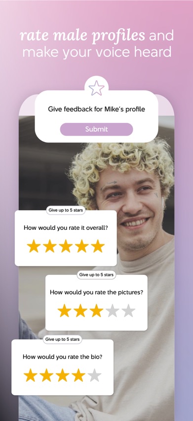
#6
rate male profiles and make your voice heard
- rate profilesnot in name
- What it shows
- A “Give feedback for Mike's profile” card with a Submit button, and three star rating cards for overall, pictures and bio.
- Why it converts
- Shows a feature built around the app's stated audience: users rate profiles. The large yellow stars are easy to read
Icon and design system
What makes the page read as one brand at a glance.

- One simple shape, two overlapping rings, with no text or photo. It stays clear at small sizes.
- The pink-to-lavender gradient matches the screenshot backgrounds and the logo, so icon and gallery read as one brand.
- The ring has no link to the word “dating” until the name is read.
- 01
Mixed-type captions
Most captions pair a light sans-serif with italic serif for the key phrase. The italics mark the words to read first and make the set feel like one voice.
- 02
A shared gradient across the images
Most screenshots use the same pink-to-lavender gradient with the caption at the top and a white card or phone below. The look matches the icon.
- 03
Values before features
The first two images state who the app is for and what it stands for. The product screens follow.
- 04
Real app screens with plain labels
Role, relationship type, kinks and ratings appear as actual options. A visitor can see what they would be asked to choose.
- 05
Low-contrast caption text
Thin white text sits on a light pink gradient. At search-result size the top lines may be hard to read.
ASO score breakdown
63 of 100 points. The full rule is under “How the ASO score works” below.
- App name23 / 25
- Uses 25 of 30 characters8.3/10
- Brand + keyword phrase10/10
- Keywords fill half the name or more5/5
- Screenshots22 / 35
- Caption on every screenshot5/5
- Each caption names a feature people search for6.7/10
- First screenshot shows the main use5/5
- One consistent design system5/5
- Readable at search-result size0/5
- Trust signal0/5
- Ratings3 / 25
- 4.0 average (full marks at 4.8)0/15
- 3,553 ratings (full marks at 100,000)2.8/10
- Freshness15 / 15
- Last update 11 days ago (full marks within 30)15/15
Where the points are
- Ask happy users for a rating+22 pts
4.0 stars from 3,553 ratings. Apple's in-app rating prompt can be shown up to 3 times a year; show it right after a user finishes something in the app.
- Use the rest of the app name+2 pts
5 characters are free. Add the next most important search term.
- Check caption terms against your subtitle and keywords
3 caption terms aren't in the app name: dating app, kinks, rate profiles. Captions don't count for search; the subtitle and the 100-character keyword field do.
Apply it to your app
A checklist for your next product page update.
- Say who the app is for in the first caption.
- Show real screens with their actual labels, so visitors see what they would do.
- Use one background and caption style across every image.
- Match the icon colors to the screenshot colors.
- Check caption contrast at thumbnail size, especially white text on light backgrounds.
- Name a feature with the word your audience uses for it.
How the ASO score works
- 01
App name, 25 points
Up to 10 for how much of Apple's 30 characters it uses, 10 for a brand + keyword structure, 5 when keywords fill half the name or more.
- 02
Screenshots, 35 points
Captions on every image, captions that name searched features, a first screenshot that shows the main use, one design system, readability at search size, and a trust signal.
- 03
Ratings, 25 points
Up to 15 for the average (from 4.0, full marks at 4.8) and 10 for the count (from 1,000, full marks at 100,000 ratings).
- 04
Freshness, 15 points
Full marks for an update in the last 30 days, falling to zero at 180 days. 85+ is excellent, 70+ strong, 50+ fair.
Common questions
What is an ASO score?
A 100-point check of the parts of an App Store page you control: the app name, screenshots, ratings and how recently the app was updated. It's our own scoring rule, shown in full on this page, not a number from Apple. Use it to compare your page with apps that already sell well in your category.
How long can an app name be on the App Store?
30 characters. A common pattern is a short brand followed by the main thing people search for, like “Chyrpe: Female-Led Dating”, which uses 25. Apple also gives you a 30-character subtitle and a 100-character keyword field for more terms.
Which screenshots show up in App Store search results?
The first one to three, when the app has no preview video. That's why the first three should cover the main reasons people download. Chyrpe uses them for dating app and dating.
How many screenshots can an iPhone app have?
Up to 10 per device size. Apple recommends focusing each screenshot after the first on one main benefit or feature. Chyrpe uses 10.
Where do the download and revenue numbers come from?
They're third-party estimates for the US App Store, not figures reported by the developer. Treat them as a sense of scale. Growth compares the latest month with the month before.
Do screenshot captions help an app rank in search?
Apple says search results use text matches in the app name, subtitle, keywords and primary category, plus user behavior such as downloads, ratings and reviews. Captions aren't on that list: they help people who already see the app decide to download. When a caption names something people search for, put that term in the keyword field too.
Where the numbers come from
- Apple: Creating your product page
- App name limit (30 characters), up to 10 screenshots, the first one to three shown in search results, keyword field.
- Apple: App Store search
- Search results use text relevance (name, subtitle, keywords, primary category) and user behavior (downloads, ratings, reviews).
- Apple: Ratings, reviews and responses
- The in-app rating prompt can be shown up to three times in a 365-day period.
- Chyrpe: Female-Led Dating on the App Store
- Name, developer, category, icon, screenshots, rating, release and update dates (US storefront), checked Nov 4, 2026.
- Downloads and revenue
- Third-party est. for the US App Store, latest month, pulled Oct 29, 2026. Not reported by the developer.
Related
Your product page wins the install.Know which campaign sent it.
Airbridge Core shows which Meta, TikTok, Google and Apple Ads campaign brought each user and what they paid. Trusted by 1,000+ brands processing 100B+ events a month. $40+/mo after a 30-day free trial, no annual contract.