Updated ASO teardown, US App Store
Bend: Stretching & Flexibility App Store optimization
A Health & Fitness app's App Store page, taken apart: the screenshots and why each one helps people decide to download, the icon and design system, and an ASO score out of 100.
- Est. monthly downloads
- 201K−0.3% vs previous month
- Est. monthly revenue
- $904K+12.2% vs previous month
- Est. revenue ÷ downloads
- $4.50
- Rating
- 4.8★174.8K ratings
Downloads and revenue are third-party est. for the US App Store, latest month vs the month before. Revenue includes renewals, so revenue ÷ downloads is a rough ratio, not what a new user pays. Estimates as of ; rating and dates from the App Store, .
Screenshots and why they convert
10 screenshots of up to 10, the first 6 shown here. The first 3 show in search results when there's no preview video.
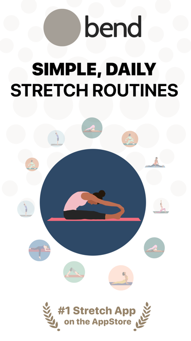
#1In search results
SIMPLE, DAILY STRETCH ROUTINES
- stretch routinesnot in name
- What it shows
- The bend logo above a headline, a ring of small stretch illustrations around one large figure, and a “#1 Stretch App on the AppStore” laurel at the bottom.
- Why it converts
- Says what the app is in the headline, so the visitor does not have to guess from the name. The ring of poses shows the range at a glance. The “#1” is the app's own claim.

#2In search results
STRETCH MORE LIVE BETTER
- What it shows
- Six routine cards (Detox, Hips, Lower Back, Splits, Pelvic Tilt, Tech Neck) with minutes under each, and “5 MILLION+ USERS WORLDWIDE” below.
- Why it converts
- Cards named for body areas and goals let a visitor spot their own need. The user count is a printed claim and sits in the first few images. The headline is a general promise, not a feature.

#3In search results
GUIDED STRETCHES TO DO EVERYDAY
- guided stretchesnot in name
- What it shows
- A Full Body routine screen with an illustrated pose pulled out in a circle, written instructions and a Benefits line (Groin, Hips, Hamstrings, Legs).
- Why it converts
- Shows that each move comes with an illustration and text steps, which answers how a beginner would know what to do. The pose circle is large enough to read at small size.

#4
ENHANCE YOUR WELL-BEING
- well-beingnot in name
- What it shows
- A Sleep routine behind an enlarged pose with SPINE and CHEST labels and an instructions card.
- Why it converts
- The labels point to the body parts worked, so the picture explains itself. The headline is broad and does not name a use case a visitor would look for.

#5
STRETCHING FOR ALL LEVELS
- stretchingin name
- What it shows
- A downward arrow beside four cards, Planks I to IV, with 2 to 5 minutes each.
- Why it converts
- Shows four plank levels, I to IV, with 2 to 5 minutes each. This speaks to beginners who worry the app is too hard.

#6
ACHIEVE BETTER MOBILITY
- mobilitynot in name
- What it shows
- A full phone screen of a routine in progress: 9 of 9, a Rag Doll pose in a circle, a 0:26 timer and pause controls.
- Why it converts
- Shows the real in-use screen with a timer, which makes the daily habit concrete.
Icon and design system
What makes the page read as one brand at a glance.

- One abstract white shape on a flat blue field, with no text and no fine detail.
- It does not show a stretching pose, so the icon alone does not say what the app does. The name and the first screenshot do that job.
- The blue is not used in the screenshots, which are black and white with illustration colors, so icon and gallery share little color.
- 01
Headline says the use
The first image names the product in plain words: stretch routines. A visitor does not need the name to understand it.
- 02
Printed proof near the front
A “#1 Stretch App” laurel on image 1 and “5 MILLION+ USERS WORLDWIDE” on image 2. Both are the app's own claims, shown early.
- 03
Flat illustrations in circles
Most poses are drawn in a flat style inside a circle. The look is consistent and does not need photos of people.
- 04
Two-line caps headlines
Bold capitals sit at the top of most images in two short lines. Short and easy to read at small size.
- 05
Real screens mixed with cards
Some images show enlarged cards or poses, others show a phone screen.
ASO score breakdown
98 of 100 points. The full rule is under “How the ASO score works” below.
- App name25 / 25
- Uses 30 of 30 characters10/10
- Brand + keyword phrase10/10
- Keywords fill half the name or more5/5
- Screenshots33 / 35
- Caption on every screenshot5/5
- Each caption names a feature people search for8.3/10
- First screenshot shows the main use5/5
- One consistent design system5/5
- Readable at search-result size5/5
- Trust signal5/5
- Ratings25 / 25
- 4.8 average (full marks at 4.8)15/15
- 174,811 ratings (full marks at 100,000)10/10
- Freshness15 / 15
- Last update 1 days ago (full marks within 30)15/15
Where the points are
- Check caption terms against your subtitle and keywords
4 caption terms aren't in the app name: stretch routines, guided stretches, well-being, mobility. Captions don't count for search; the subtitle and the 100-character keyword field do.
- Win back installs
Downloads fell 0.3% while revenue rose 12.2%. A product page that converts more of its visitors wins installs back without more ad spend.
Apply it to your app
A checklist for your next product page update.
- Say what the app does in the headline of screenshot 1.
- Put your best proof, such as a rank or a user count, in the first two images and print it large.
- Name routines or modes after what the user wants, such as Lower Back or Tech Neck.
- Pull the key part of a screen out of the phone frame so it reads at small size.
- Keep one illustration style and one headline style across all images.
- Make the icon say what the app does, or let the first screenshot do it clearly.
How the ASO score works
- 01
App name, 25 points
Up to 10 for how much of Apple's 30 characters it uses, 10 for a brand + keyword structure, 5 when keywords fill half the name or more.
- 02
Screenshots, 35 points
Captions on every image, captions that name searched features, a first screenshot that shows the main use, one design system, readability at search size, and a trust signal.
- 03
Ratings, 25 points
Up to 15 for the average (from 4.0, full marks at 4.8) and 10 for the count (from 1,000, full marks at 100,000 ratings).
- 04
Freshness, 15 points
Full marks for an update in the last 30 days, falling to zero at 180 days. 85+ is excellent, 70+ strong, 50+ fair.
Common questions
What is an ASO score?
A 100-point check of the parts of an App Store page you control: the app name, screenshots, ratings and how recently the app was updated. It's our own scoring rule, shown in full on this page, not a number from Apple. Use it to compare your page with apps that already sell well in your category.
How long can an app name be on the App Store?
30 characters. A common pattern is a short brand followed by the main thing people search for, like “Bend: Stretching & Flexibility”, which uses 30. Apple also gives you a 30-character subtitle and a 100-character keyword field for more terms.
Which screenshots show up in App Store search results?
The first one to three, when the app has no preview video. That's why the first three should cover the main reasons people download. Bend uses them for stretch routines and guided stretches.
How many screenshots can an iPhone app have?
Up to 10 per device size. Apple recommends focusing each screenshot after the first on one main benefit or feature. Bend uses 10.
Where do the download and revenue numbers come from?
They're third-party estimates for the US App Store, not figures reported by the developer. Treat them as a sense of scale. Growth compares the latest month with the month before.
Do screenshot captions help an app rank in search?
Apple says search results use text matches in the app name, subtitle, keywords and primary category, plus user behavior such as downloads, ratings and reviews. Captions aren't on that list: they help people who already see the app decide to download. When a caption names something people search for, put that term in the keyword field too.
Where the numbers come from
- Apple: Creating your product page
- App name limit (30 characters), up to 10 screenshots, the first one to three shown in search results, keyword field.
- Apple: App Store search
- Search results use text relevance (name, subtitle, keywords, primary category) and user behavior (downloads, ratings, reviews).
- Apple: Ratings, reviews and responses
- The in-app rating prompt can be shown up to three times in a 365-day period.
- Bend: Stretching & Flexibility on the App Store
- Name, developer, category, icon, screenshots, rating, release and update dates (US storefront), checked Nov 4, 2026.
- Downloads and revenue
- Third-party est. for the US App Store, latest month, pulled Oct 29, 2026. Not reported by the developer.
Related
Your product page wins the install.Know which campaign sent it.
Airbridge Core shows which Meta, TikTok, Google and Apple Ads campaign brought each user and what they paid. Trusted by 1,000+ brands processing 100B+ events a month. $40+/mo after a 30-day free trial, no annual contract.